Incarnate Games

Art into Play™

Episode 34 – Revenant Icon Finals

social_art_banners_the-incarnate-process_022616episodes_episode-text_034AKings_banners_the-incarnate-process_032616Revenant_Icon_4

Welcome to The Incarnate Process Episode 34 – Revenant Icon Finals

Project: Ascended Kings

Graphic Design: Revenant Icon

Discussion below:


Anthony Benedetto

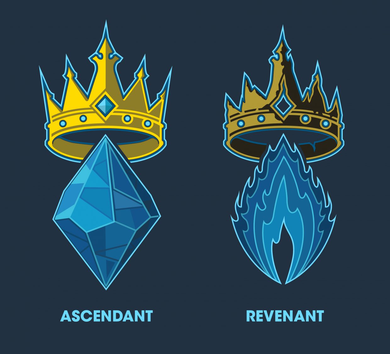
Alright… Revenant Icon!

Let me know!

Posted


Jason Allen
Jason Allen

Nice! I like how the bottom part of the flames all smooth together into a single point on each side, the flames look great bro.

I think that the coloring of the crown accomplishes the grunge and dilapidation that we were talking about! Very nice. I am happy with how messed up it is! Lol. It looks really good is what I mean of course, haha.

Can we see what it looks like if you reverse the order of the colors in the fire going the other direction? So that we start dark on the inner flames and then get to the brightest color on the outside? I’d like to compare the two and get peoples thoughts.

Also, I think we should remove the bright blue circles in the middle of the gem sockets like we were talking about, so that they appear empty.

Awesome job! Very cool man, I like how it has turned out.

Posted 2014


Anthony Benedetto

Alright, stay tuned for those changes.

Posted


Anthony Benedetto
Here they are. I prefer ALT 2.
That, or the original flame with the crown from ALT 1. Yeah that is my choice!
Posted 014

Jason Allen
Jason Allen

Yeah!

I’m on board with Alt 2 as well. I think that the color order of the original flame is better now that I see it together with the reversed one.

Seeing the the single bright blue outlines for the empty sockets on Alt 2 really helps point them out much better, I also think that it helps balance the fact that the hollow circle area beneath them is outlined in the darker blue. It gives the sockets a more “forward” appearance.

I see what your saying about having the original flame with Alt 1, but when I compare ALT 1 crown to the ALT 2 crown I think the darker color outline for the sockets on ALT 1 may be causing it to look a little more “flat” than that of the brighter outlines in ALT 2.

I would say Alt 2 is my choice. Let me know your thoughts.

Posted


Anthony Benedetto
Great, I’ll package everything up tomorrow including the Glyphs, and send it over.
Posted 014

END EPISODE # 034


Stay tuned for EPISODE # 035: Vara Rough 2 which will be posted soon!

Thank you for stopping by!

Artwork © 2014 Anthony Benedetto.

Incarnate Games Inc, Ascended Kings, Omega Mundus series, the Incarnate Games logo, the Ascended Kings logo and all associated marks, names, foci, characters, models, environments, illustrations and images from the Ascended Kings and/or Omega Mundus series are either ®,™, and/or © Incarnate Games, Inc 2013-2016. All Rights Reserved. Used under exclusive copyright rights by Incarnate Games Inc.
Next Post

Previous Post

Leave a Reply

© 2024 Incarnate Games

Theme by Anders Norén

Become an Omega Club member for exclusive offers.


* indicates required


Email Format